0–3s into the thirty01 of 06
Is this the right kind of speaker?
What it said beforeFail
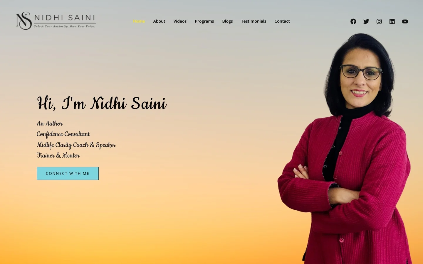
“Hi, I’m Nidhi Saini”
Over four job titles: Author, Confidence Consultant, Midlife Clarity Coach & Speaker, Trainer & Mentor. All about her, none about the reader.
What it says nowPass
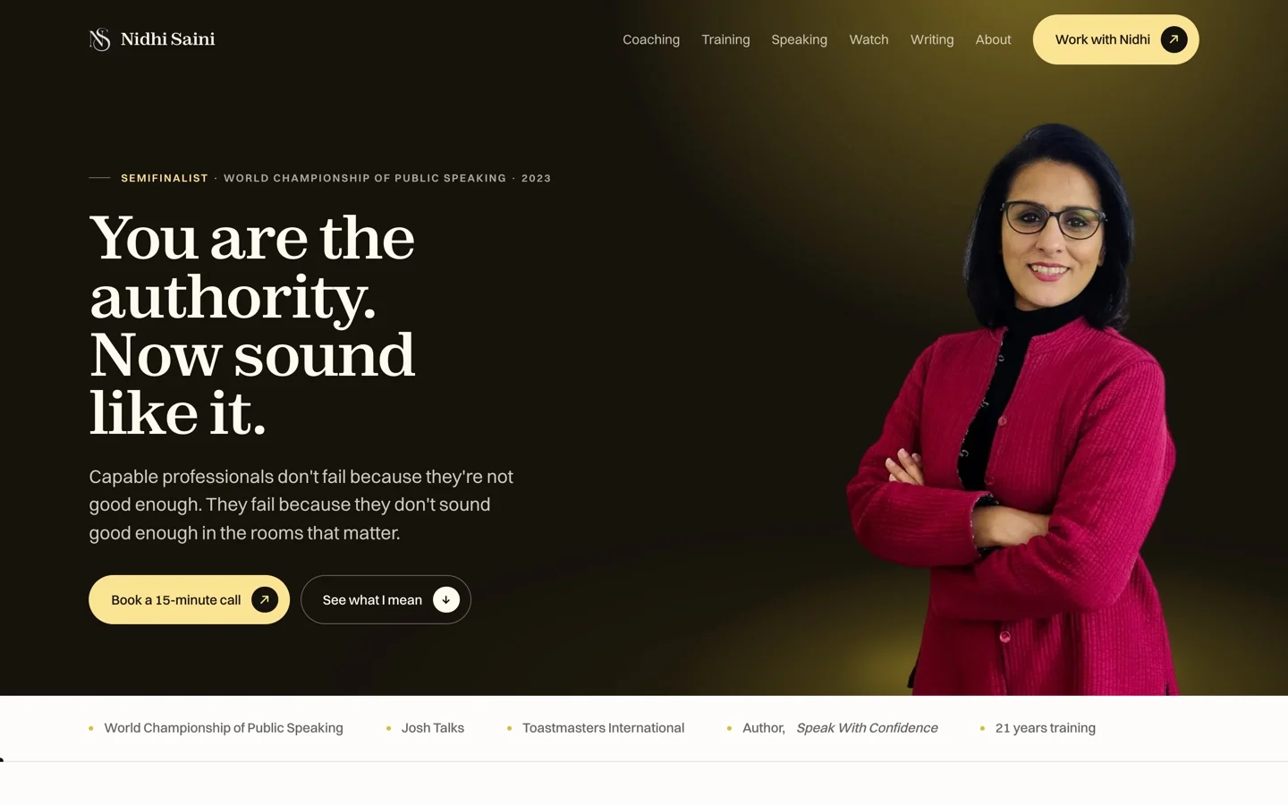
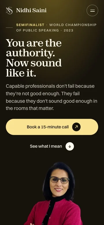
“You are the authority. Now sound like it.”
One line, aimed at a problem the reader already has, before a single word about who she is.
3–8s into the thirty02 of 06
What are the talks, exactly?
What it said beforeFail
/speaking · 404
There was no speaking page at all. The one page an event organiser looks for first did not exist.
What it says nowPass
“Keynotes, named, with lengths, languages and formats.”
Plus a speaker deck that downloads in one click, so nothing has to be asked for by email.
8–14s into the thirty03 of 06
Have you done it at my scale?
What it said beforeFail
Nothing on the first screen
The credentials existed, four scrolls down, under a heading about her journey, where nobody comparing four speakers would reach them.
What it says nowPass
“Semifinalist, World Championship of Public Speaking.”
Then Josh Talks, Toastmasters International, and twenty-one years of training, all above the fold.
14–22s into the thirty04 of 06
Can I watch ninety seconds of you?
What it said beforeFail
A black rectangle
Where a video should have been. Roughly a fifth of the page height, showing nothing at all.
What it says nowPass
“A reel that plays where it sits.”
On the first screen, without leaving the page: usually the hardest thing to find on a speaking site.
22–27s into the thirty05 of 06
How much work is enquiring?
What it said beforePartial
“Hi , Would you like to book A Call ?”
The mechanism was there, which is why this one scores a half. Two stray spaces and a capital mid-sentence, in the one strip on the page asking for the sale.
What it says nowPass
“Book a call: fifteen minutes, and she’ll tell you whether she can help.”
One form, four fields, and a plain statement of what happens next.
27–30s into the thirty06 of 06
Can I forward it to the committee?
What it said beforeFail
/training · 404
No training page either. Nothing a corporate L&D buyer could send on to the people who sign off.
What it says nowPass
“Four routes, named and priced.”
One-to-one, ACE Club, ACE Bootcamp and the Speak Up Guide, each with what it costs and who it is for.